The notification panel in Filament allows one to view notifications by clicking on the notification button. In this trick, I teach how to re-use that panel in other places of your application where you want to display some custom information in a similar panel.
I use a similar strategy in the package filament-page-hints to display the page hints in a sliding panel.
The notification panel is basically a modal but just styled differently so if you can think of how to trigger a modal manually (as described in this trick) from your filament views it's similar if not the same.
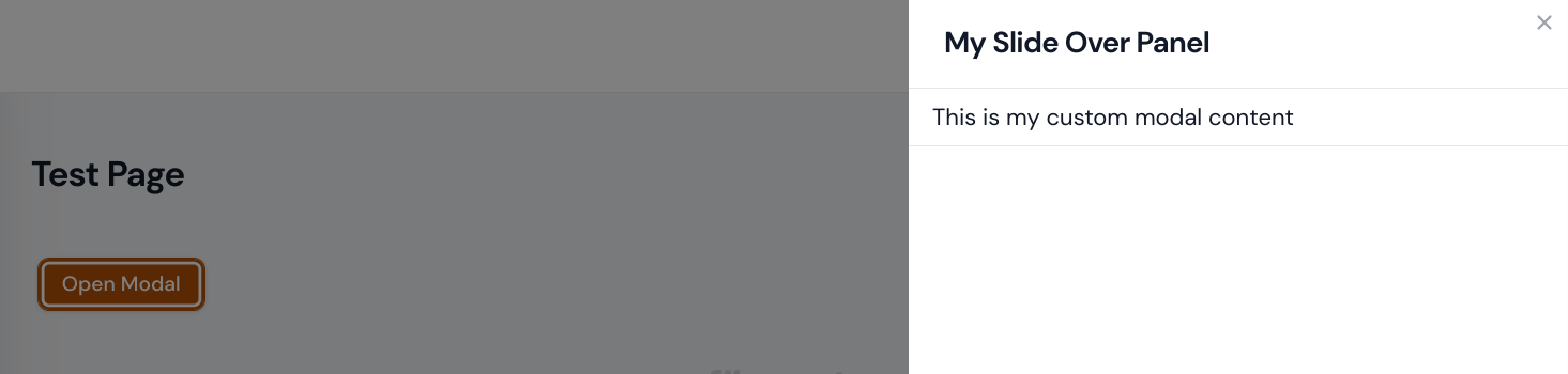
<x-filament::modal id="my-modal" close-button slide-over width="md"> <x-slot name="header"> <x-filament::modal.heading class="relative"> <span>My Slide Over Panel</span> </x-filament::modal.heading> </x-slot> <div class="mt-[calc(-1rem-1px)]"> <div @class([ '-mx-6 border-b border-t', 'dark:border-gray-700' => config('notifications.dark_mode'), 'dark:border-gray-800' => config('notifications.dark_mode'), ])> <div @class([ 'py-2 pl-4 pr-2 -mb-px space-y-2', 'dark:bg-gray-700' => config('notifications.dark_mode'), ])> <p> This is my custom modal content </p> </div> </div> </div></x-filament::modal>To now trigger the modal, we can then use a simple button click
<button x-data="{}" x-on:click="$dispatch('open-modal', { id: 'my-modal' })"> Open Modal</button>On the trigger, the
x-data="{}"property is required if you use a normal HTML button but if you were to use the filament component button,<x-filament::button x-on:click="$dispatch('open-modal', { id: 'my-modal' })">Open Modal</x-filament::button>, you won't need to add that property.
No comments yet…